Interiors · 2016 · Competition
Nordstrom Miami Flagship
A comprehensive facade and interior design for Nordstrom's Miami flagship, an invited competition entry that developed a continuous Voronoi-patterned language across the building skin, structural columns, ceiling canopies, floor surfaces, and custom display furniture, creating a unified retail identity from streetscape to sales floor.
About the project
Facade as Identity
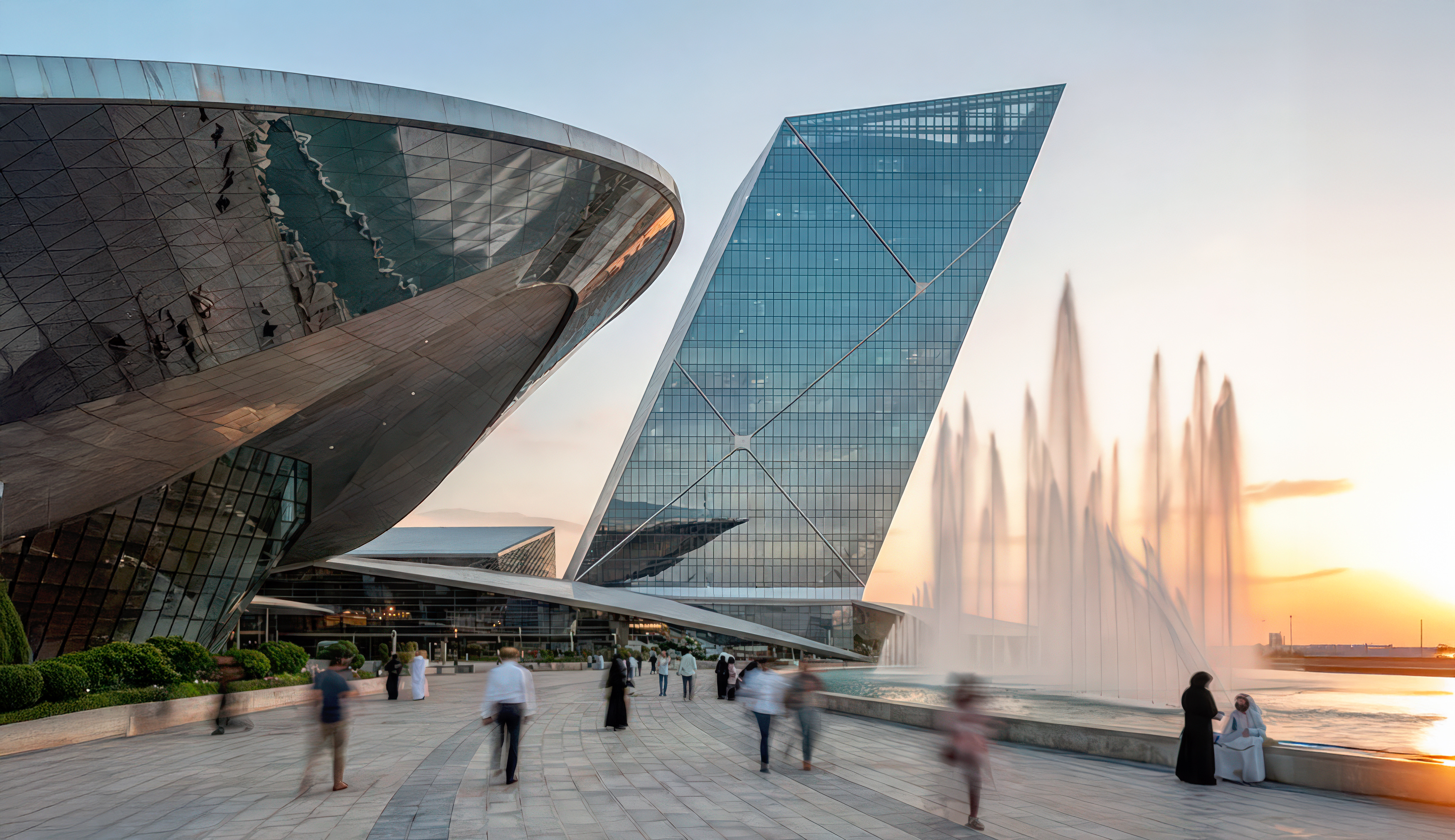
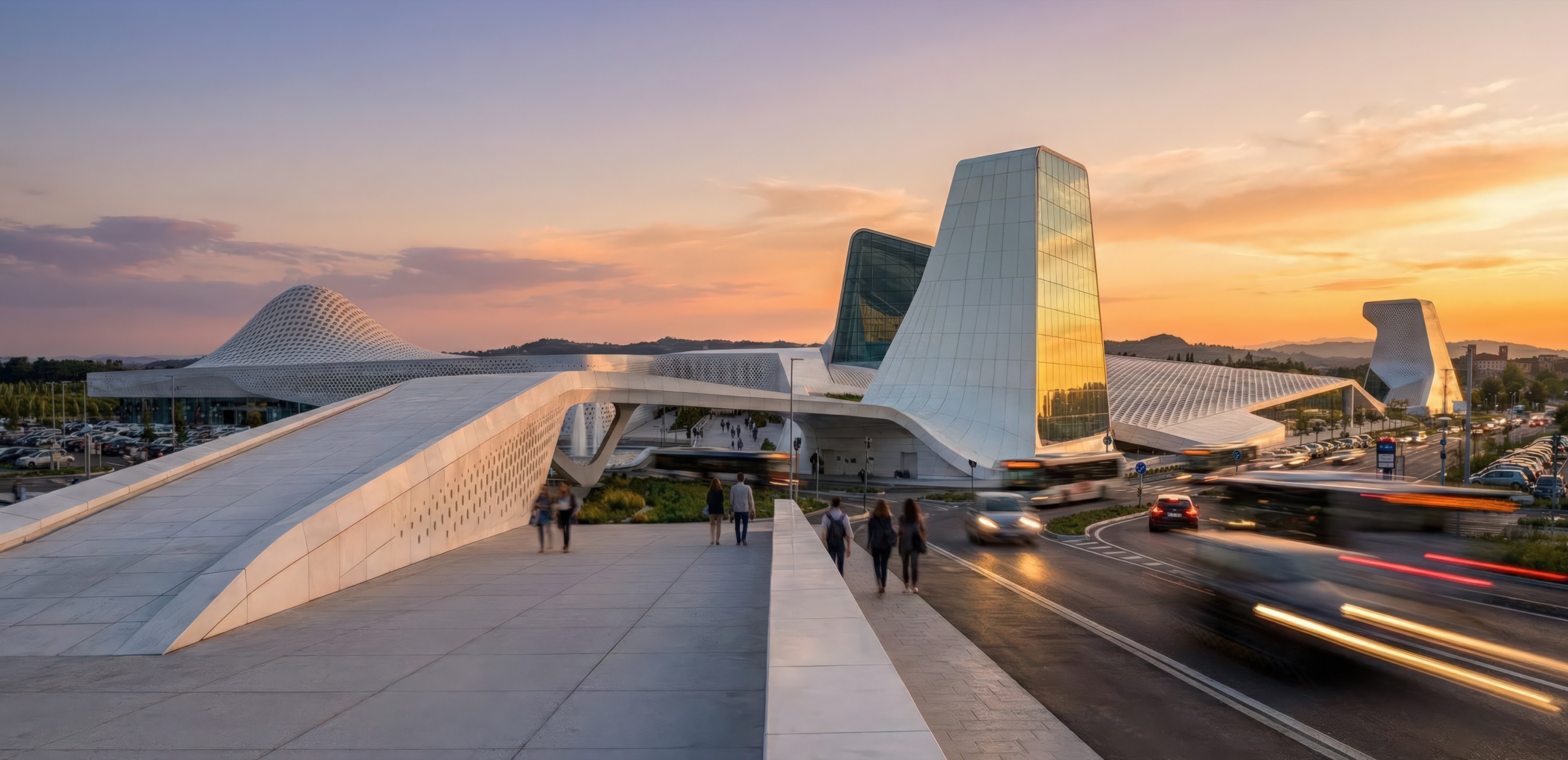
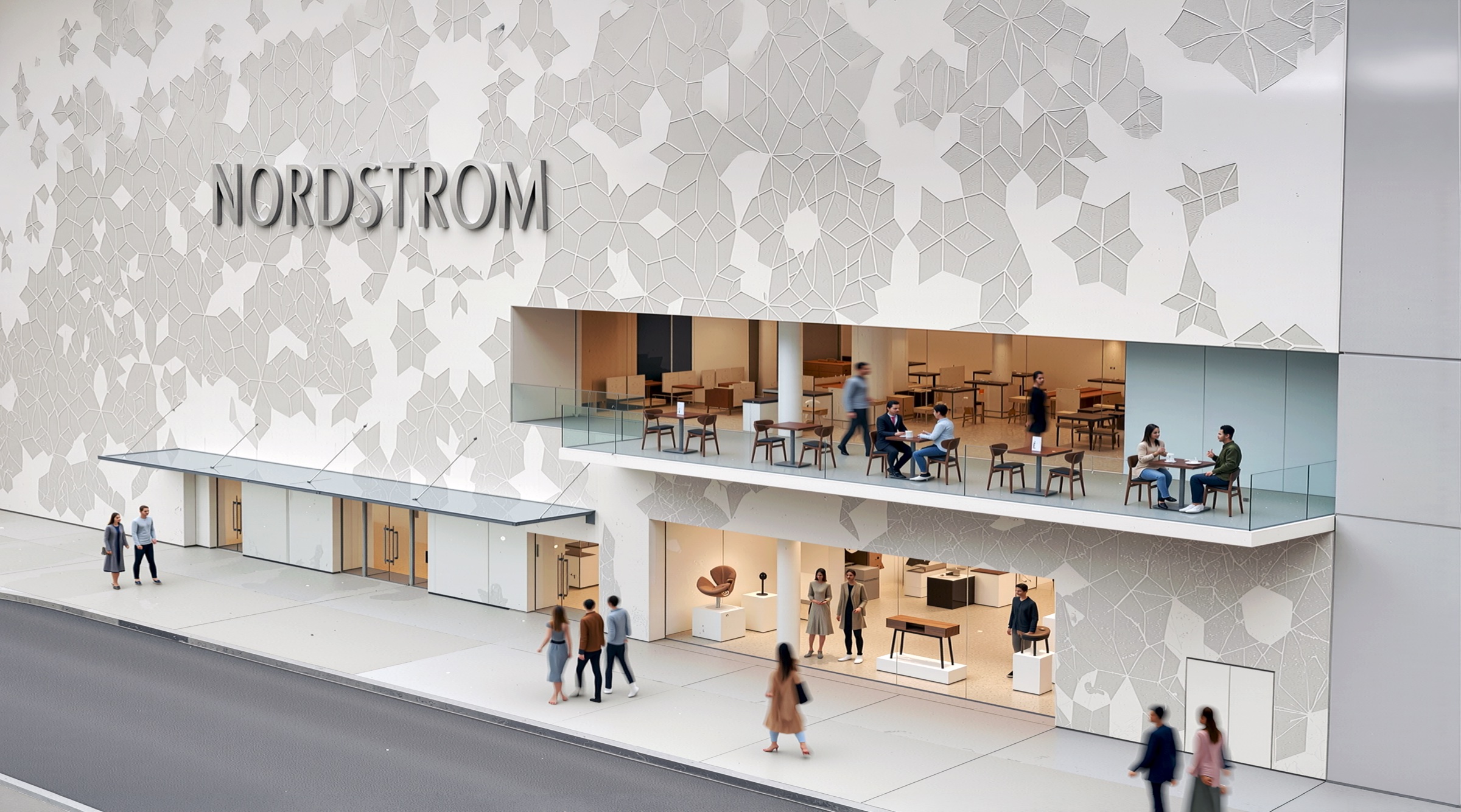
The design for Nordstrom’s Miami flagship began at the building envelope. A perforated screen wraps the upper levels of the facade in an organic Voronoi pattern, an irregular cellular geometry drawn from natural growth structures, punched through a white composite surface to create a lace-like veil over the glazed interior. The pattern is not decorative appliqué but a functional element: it filters Miami’s intense sunlight, provides privacy for the upper-level restaurant and lounge, and establishes a visual identity for the store that is immediately legible from the street. At ground level, full-height glazing opens the retail floor directly to the sidewalk, framing the merchandise displays as a continuous vitrine. The NORDSTROM lettering sits within the perforated field, integrated into the pattern rather than applied over it, so that brand and architecture read as a single gesture.
Voronoi System
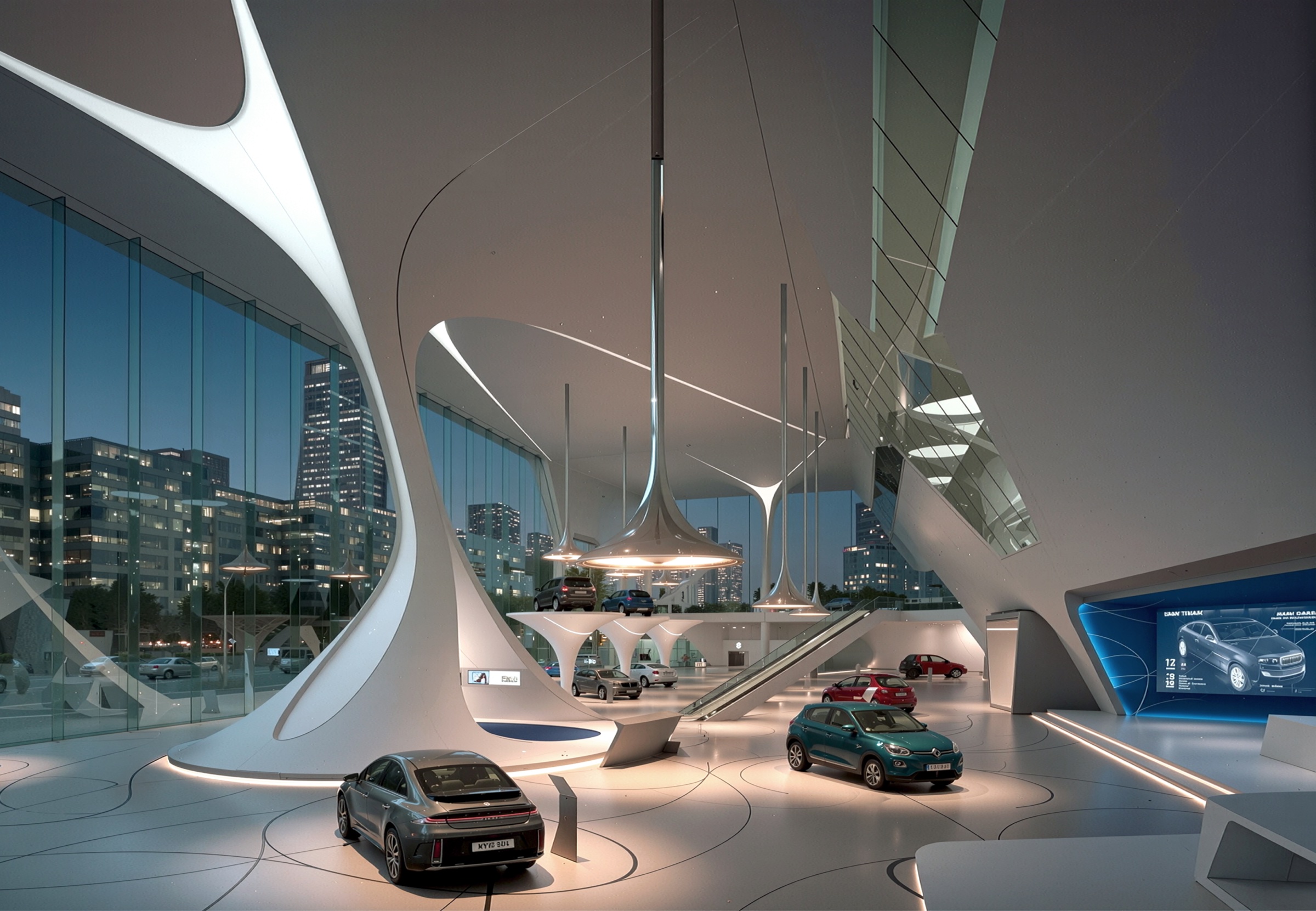
The organic cellular pattern established on the facade migrates into the interior as a total design system. Structural columns are wrapped in perforated sleeves that echo the facade screen, transforming utilitarian elements into ornamental markers that orient shoppers within the open floor plan. Overhead, a large-scale suspended canopy reproduces the Voronoi geometry in metallic blue-grey panels, defining the central atrium and marking the intersection of the main circulation paths. At the escalator well, the pattern becomes a skylight, a luminous Voronoi ceiling that filters daylight down through the multi-level volume. On the beauty floor, the same cellular logic reappears as a golden inlay across the polished floor surface, wrapping upward onto column cladding and counter panels. The system is chromatic as well as geometric: each department receives its own color register, cool silver-blue on the shoe and accessories levels, warm gold on beauty, while the underlying pattern remains constant, binding the entire store into a single spatial identity.
Custom Furniture and Display
Every piece of display furniture was designed as part of the architectural system. Faceted origami-like pedestals in folded metal serve as merchandise islands on the accessories floor, their angular geometry a complement to the organic curves of the Voronoi screens surrounding them. On the cosmetics level, wire-frame display tables with crystalline geometries punctuate the space between brand counters, providing a neutral architectural datum against which the individual brand identities, Chanel, Clinique, and others, can assert themselves without competing with the store’s own language. Seating elements, consultation counters, and cash-wrap stations share the same faceted vocabulary, so that every object in the store reads as purpose-designed rather than procured.
Departmental Atmospheres
While the Voronoi system provides continuity, each floor cultivates its own atmosphere through material and chromatic variation. The shoe salon is the most restrained, polished concrete, white walls, continuous shelving, allowing the merchandise to dominate the visual field. The accessories floor introduces more sculptural elements: a suspended installation of metallic leaves floats above the origami pedestals, creating a canopy of reflected light. The cosmetics department is the most chromatic, with pale blue flooring and pink-lit brand vitrines producing an atmosphere closer to a beauty lounge than a department store. The beauty floor pushes furthest, saturating columns, floor, and counters in a unified warm gold that transforms the space into an immersive environment rather than a conventional retail layout.
Vertical Circulation as Experience
The escalator well is treated as a spatial event rather than a utilitarian connection. Rising through a double-height void beneath the Voronoi skylight canopy, the escalators pass a large-scale black-and-white floral art panel that occupies the full height of the adjacent wall, an art-gallery gesture inserted into the department-store section. The canopy above glows with diffused blue daylight, casting soft cellular shadows across the white walls and creating a moment of visual calm between the densely merchandised floors. The experience of moving between levels becomes a decompression, a brief passage through a luminous, almost ecclesiastical space, before re-entering the next department’s distinct atmosphere.