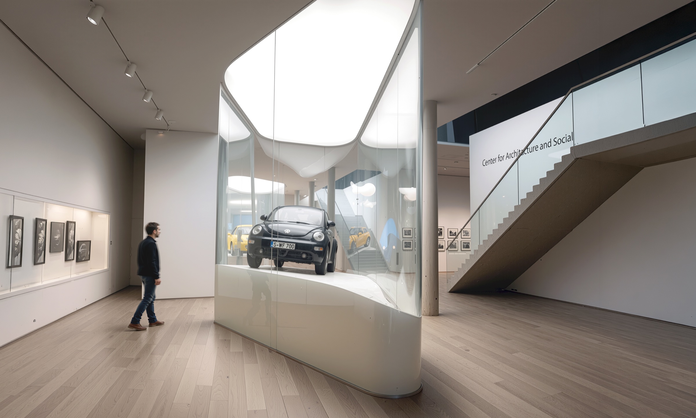
A comprehensive interior design for new departments within Moscow's TSUM — the historic department store on Petrovka Street owned by the Mercury Group — introducing a faceted crystalline architectural language of angular white surfaces and integrated LED lighting that unifies fashion, fragrance, lifestyle, children's, and lounge zones within one of Eastern Europe's most prominent luxury retail destinations.
TSUM and the Mercury Group
TSUM — Tsentralny Universalny Magazin — has occupied its Gothic Revival building on Petrovka Street since 1908, steps from the Bolshoi Theatre and Red Square. Following the Mercury Group’s acquisition in 2002, the store was transformed from a Soviet-era department store into one of the most significant luxury retail destinations in Europe, housing over a thousand international brands across six floors. Asymptote was commissioned by Mercury to design a series of new departmental interiors that would introduce a contemporary architectural identity into the historic building — spaces that could accommodate the curatorial demands of global luxury brands while asserting TSUM’s own spatial character as something more than a neutral container for merchandise.
Crystalline Envelope
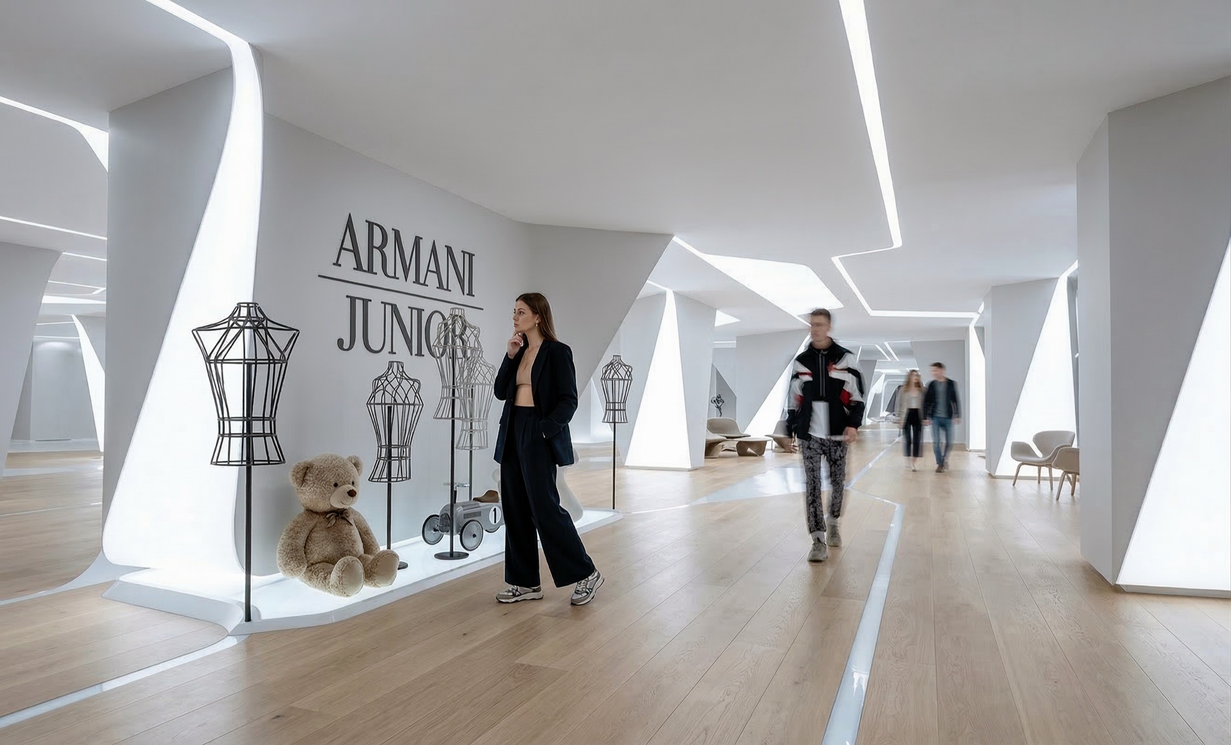
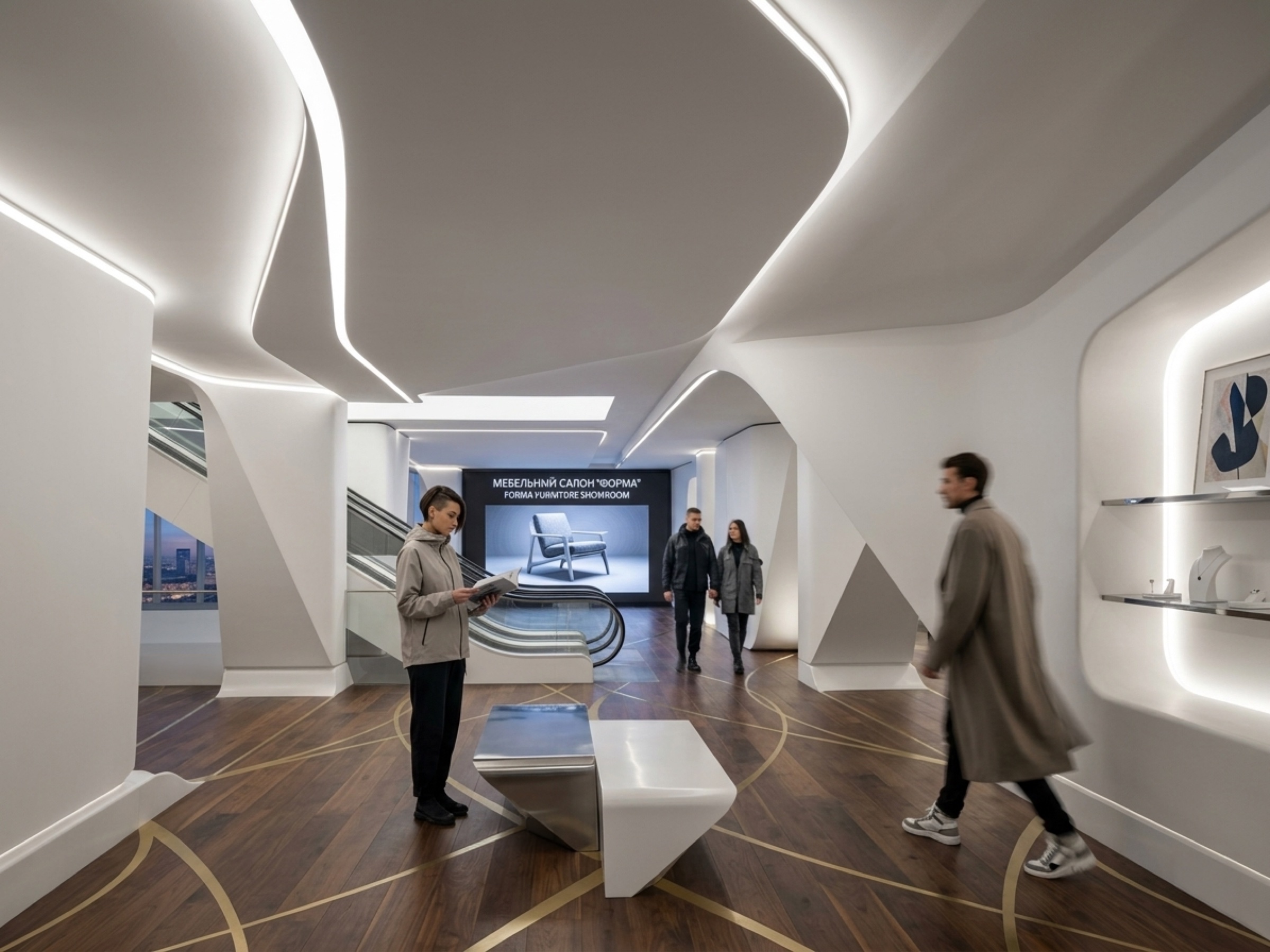
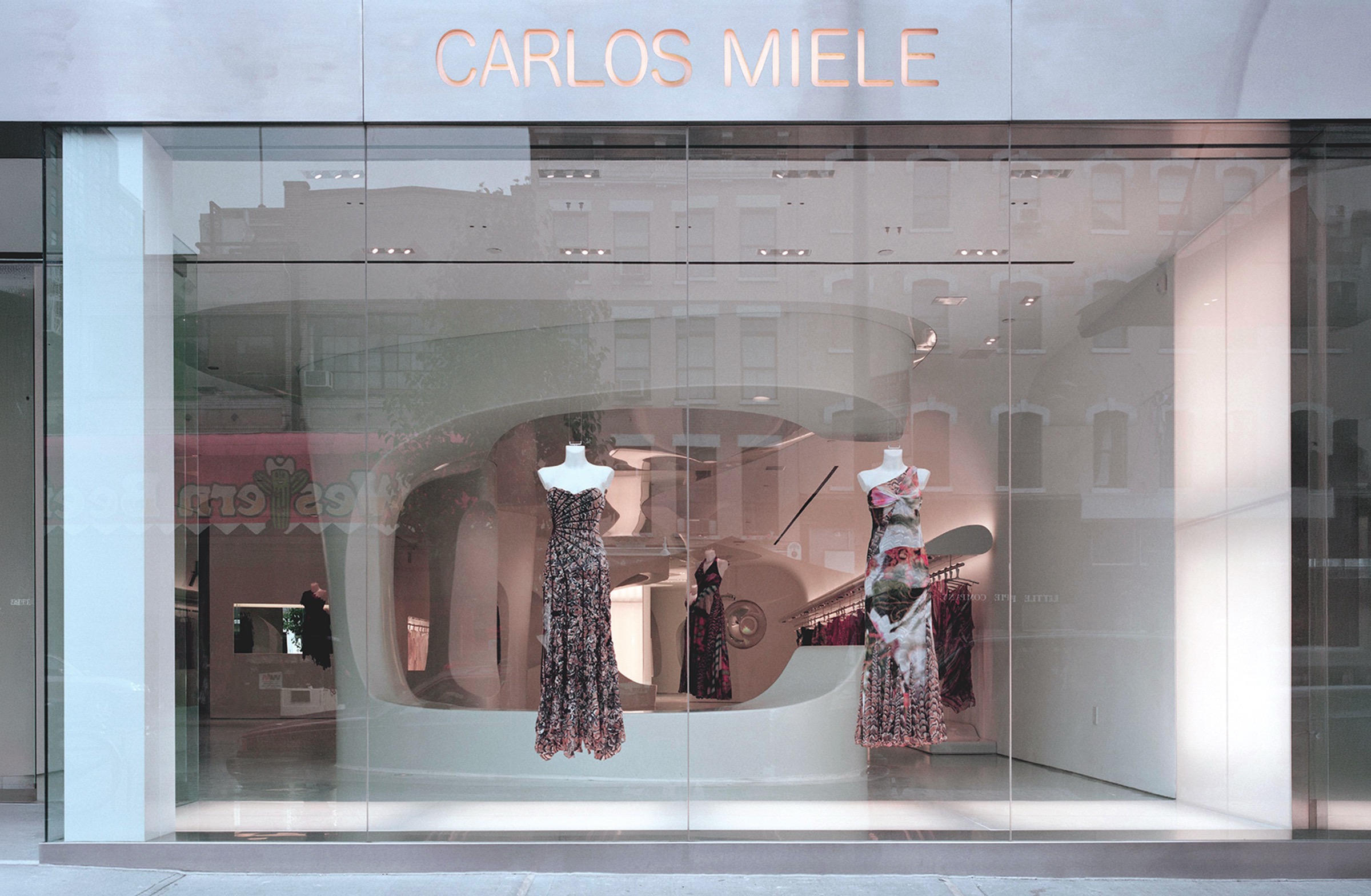
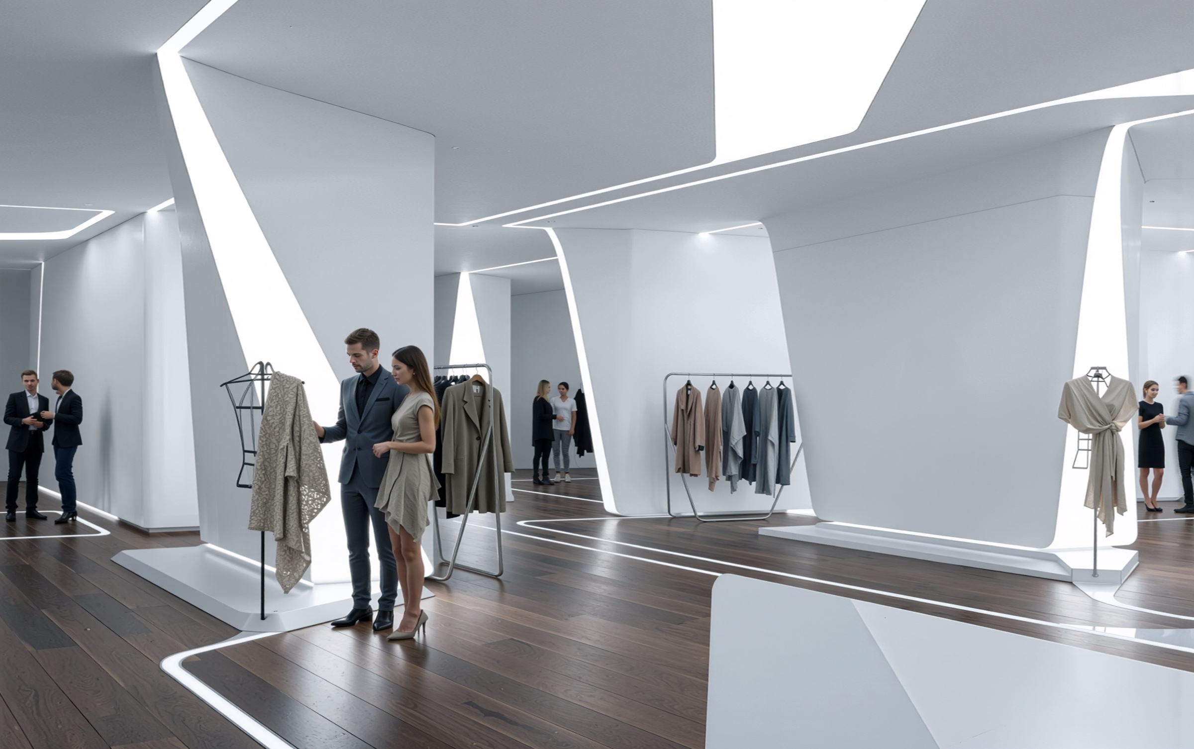
The design establishes a singular architectural language across all departments: faceted white surfaces — walls, ceiling planes, columns, and transitions — folded and angled to produce a continuous crystalline envelope. Integrated LED strip lighting follows every fold and edge, tracing the geometry in luminous lines that simultaneously define the architecture and illuminate the merchandise. The effect is of a space carved from a single block of light — an interior where structure, surface, and illumination are indistinguishable. Dark walnut flooring anchors the composition, providing warmth and material weight beneath the angular white canopy and grounding the otherwise weightless geometry in the tactile reality of a floor underfoot.
Departmental Identities
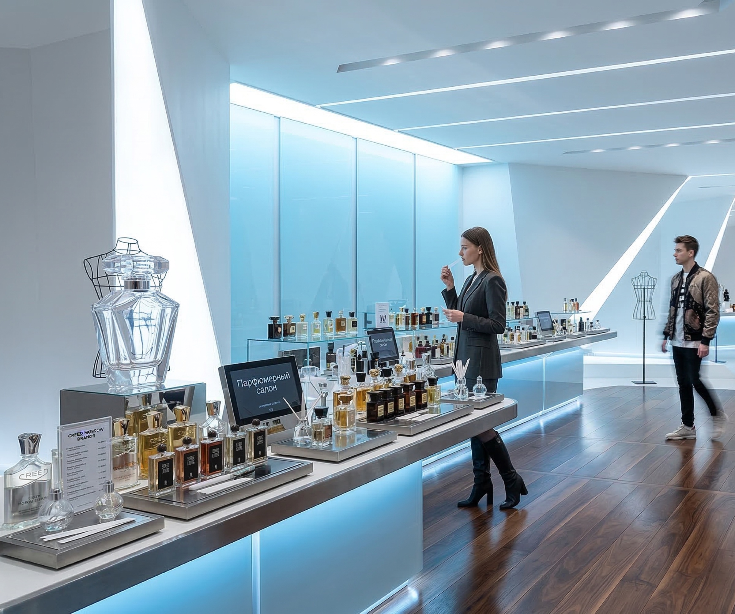
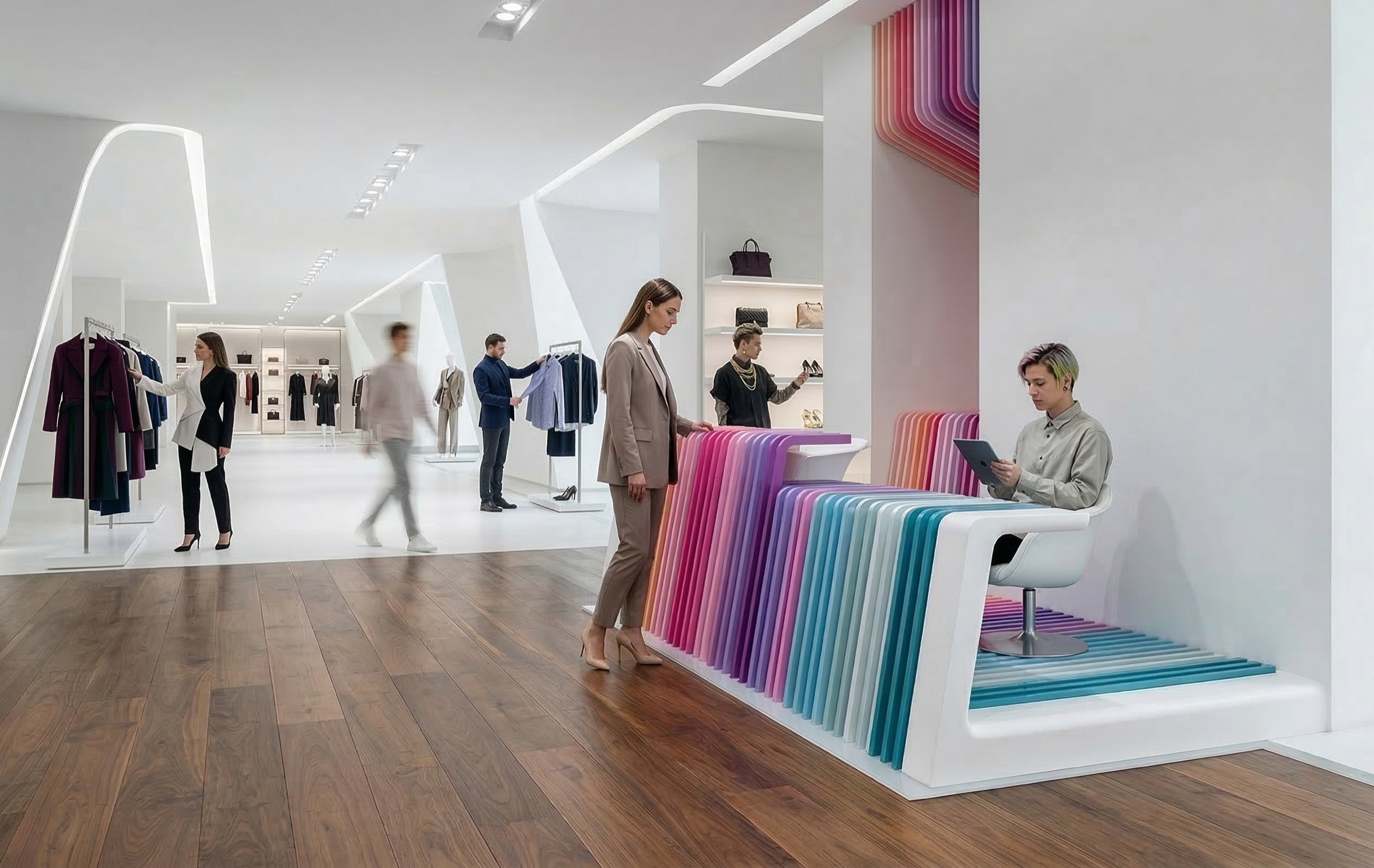
While the faceted white language provides continuity across the store, each department receives its own chromatic and atmospheric identity. The perfumery salon deploys blue-backlit glass vitrines — long, luminous counters that cast a cool aquatic glow across the dark floor, transforming fragrance shopping into an immersive sensory environment. The fashion floors introduce bursts of saturated color through custom-designed seating elements: benches upholstered in rainbow-striped fabric that erupt from the white architectural volumes like chromatic geological strata. The Armani Junior children’s department maintains the angular rigor of the adult floors but softens it with oak flooring and playful display vignettes — teddy bears and wire dress forms staged within the same faceted alcoves that elsewhere hold couture.
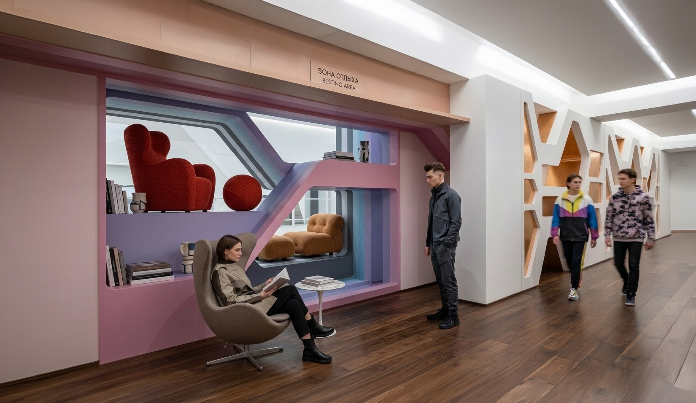
Lounge and Cultural Zones
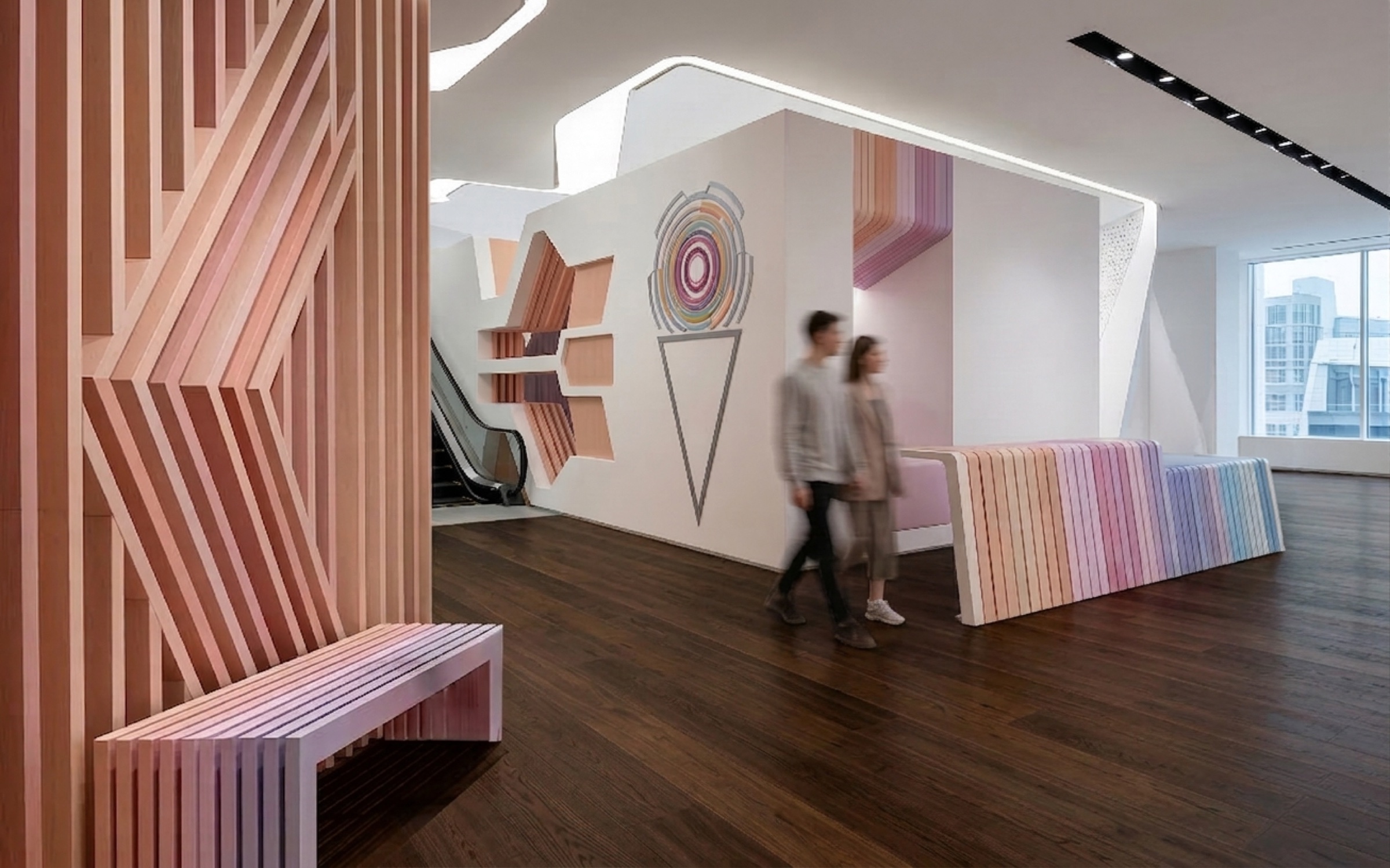
The design recognizes that a contemporary luxury department store must offer more than retail. A dedicated lounge and reading zone introduces a radically different palette: warm mauve and pink-painted alcoves containing bookshelves, red upholstered armchairs, and a recessed daybed nook — a domestic, almost residential atmosphere deliberately opposed to the crystalline precision of the sales floors. Adjacent corridors feature angular gold-framed openings cut into the white walls, creating a gallery-like sequence of framed views. A children’s zone near the escalators deploys pink slatted timber columns and playful geometric wall graphics — ice-cream cones, concentric circles — announcing the transition to the kids’ departments with an uncharacteristic warmth and humor that nonetheless remains architecturally resolved.
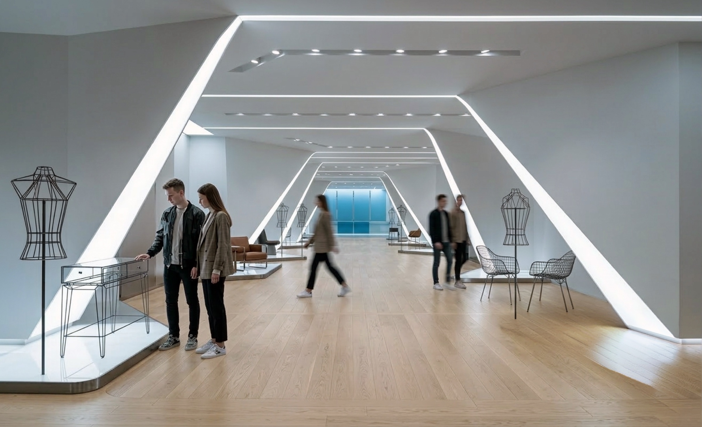
Lifestyle Gallery
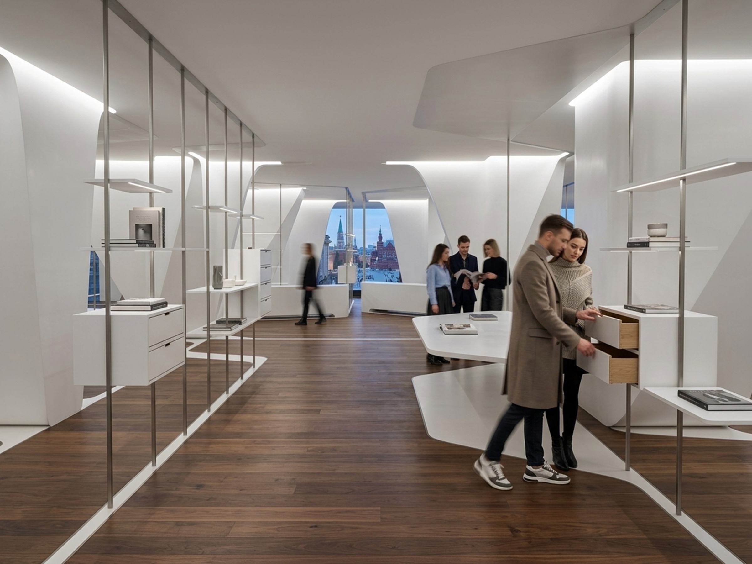
The lifestyle and accessories department occupies what may be the most architecturally refined space in the scheme. Slender steel shelving units — almost invisible vertical lines — carry curated objects and books against the faceted white walls. A sculpted white display table provides a central focus for featured products. At the far end, the angular architecture frames a window looking out over the Moscow skyline at dusk — the Kremlin towers and the city’s rooftops visible through the faceted aperture. The gesture is deliberate: it positions the store’s curated interior as a lens through which to view the city, and the city as the ultimate context for the objects within.
Light as Material
Throughout the project, light is treated not as a service element but as the primary architectural material. The LED strips integrated into every edge and fold of the faceted surfaces produce a condition where the architecture appears to generate its own luminosity — glowing from within rather than being illuminated from above. In the main gallery corridors, the effect is most pronounced: the angular white envelope and its luminous seams create a spatial experience closer to moving through a faceted crystal than through a department store. The lighting shifts in intensity and color temperature across departments, reinforcing each zone’s distinct atmosphere while maintaining the formal continuity of the faceted language that binds the entire intervention together.